Both Google and Apple have already begun to show the winning tricks in their respective annual events to show their strength and see who takes the lead in the complex mobile device industry. The recent presentation of the new versions of their respective operating systems for smartphones and tablets is not trivial,Following the debut of iOS 8 at WWDC in early June, it was no wonder that a few weeks later Google struck back with the announcement of Android L.
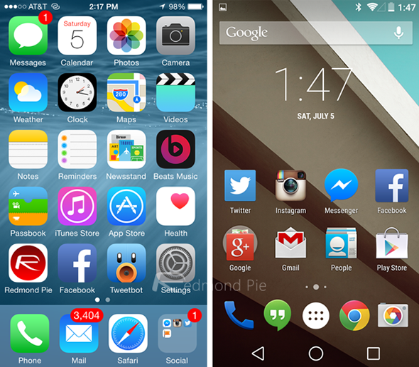
It should be said that we are facing two systems still in development, but Thanks to the launch of their respective Beta versions, we can see where the shots of both companies are going to go, especially at a visual level. Obviously, both platforms have their own identity and philosophy, but it is true that in some areas they offer certain similarities.
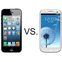
But really ... can these systems be comparable? This is precisely what we want to find out. Beyond the classic differences at the hardware and software level of both platforms, we want Focus on graphical aspects by comparing images from the Android L preview and the iOS 8 Beta.
Various interface features and design elements
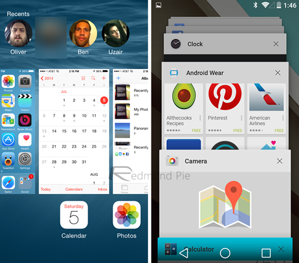
Apple has not revolutionized its graphical aspect this year as it did at the time with iOS 7, and this time, they continue to bet on a conservative line with a design considered "flat". Although those of Cupertino have incorporated a style keyboard with the contextual inputs of iOS 8 and new shortcuts for those users who mostly use the multitasking function of their iDevice.
Instead With Android L, Google has introduced a new interface called "Material Design". This new style resembles the same change that Apple made with iOS 7, abandoning the realistic (or skeuomorph) aspect of previous versions for a more minimalist cut in terms of typography and color selection. A style based on layers and other design elements such as animations, shadows, or bumps. In this sense, Google will allow developers to easily incorporate this type of style in their applications.
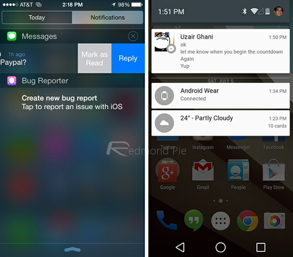
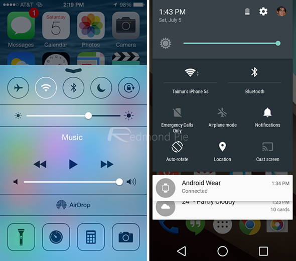
As the captures of the colleagues of redmonpie.com show us, it seems both companies “have agreed” to offer a similar visual aspect in several of their services, betting on a neat, neat, elegant and simple interface. Is this similarity a coincidence?
Various differences at the level of functionality
If we speak at a functional level, both Google and Apple have put the batteries to offer enough news in their new systems. In iOS 8 we can highlight the new continuity and transition features, an optimized multitasking, the renewed iCloud service, the Health app or a new programming system (Swift) more open to third-party applications.
Meanwhile, Android L does not provide so many functionalities but they are not negligible either: a new notification center, automatic unlocking or its perfect integration with the Android Wear system, These are quite interesting innovations compared to the previous version.
At the moment, Apple is still in the lead
Despite the fact that these are two valid systems and that they have a lot to contribute, maybe we opt sensibly for iOS 8, considering that it starts with some advantage over Android L, but basically for details such as the efficiency of its multitasking system, or the introduction of more features like its continuity system.Visually, it is always a matter of taste but the differences seem minimal.
Fountain:
http://www.applesfera.com/









No Comment