Every day, consumers are confronted with innumerable logos, most do not realize how these icons are constantly transmitting messages for the subconscious.
“The logo of a company is its shorthand, a visual signal that tells the brand culture history, behavior and values, ”said Su Mathews Hale, partner at Lippincott, a brand strategy and design firm in New York. A logo can take a second to tell its story, creating one can sometimes be the most complicated aspect of branding.
We got him to walk us through some of the projects he's worked on, as well as some corporate logos that he admires.
Wal-Mart Stores
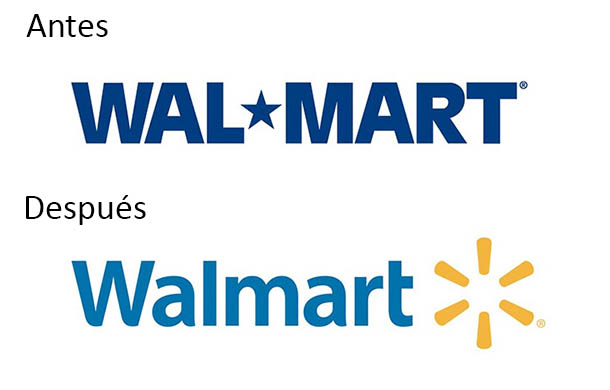
In 2005, Wal-Mart hired Lippincott to reformulate its brand. He wanted to get rid of the idea that it was a big company for cheap products and see himself as a place where people could save money and buy quality food. Wal-Mart debuted its new logo in 2008.
Mathews and his team felt that the old logo screamed "corporation" and had been linked to the popular view of critics who saw Wal-Mart as a malevolent giant crushing small businesses in the world.
They also said that the star used as a script was not remembered by people. They believed that a business with a hyphenated word linked them to inexpensive corner stores.
They decided to stick with the color blue, but they went for a shade lighter than they thought evoked modernity and confidence. It replaced the sharp angles of the original letters with a more humanistic typeface. They finally decided on an asterisk symbol that they wanted to look like “a light bulb turning off in your head,” a metaphor for Wal-Mart shoppers being smart about taking advantage of cheap, quality products.
They chose a shade of yellow that gave hope but not very bright, as "this color is associated with low-cost items in retail," said Mathews. She was happy to learn that the focus groups also identified this asterisk as a sun or a flower, both positive associations.
eBay
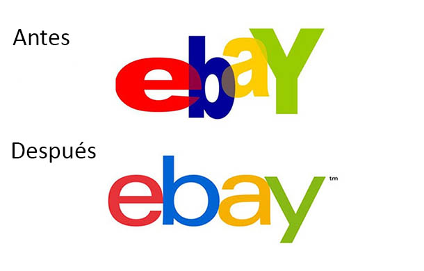
In 2012 this brand had the opposite problem of Wal-Mart. He wanted to grow and his logo was getting in the way of ambition. Mathews said that when internet companies have messy, electrical logos, they create memories of companies that died when the .com bubble burst.
So for eBay, her and her team approximated the original design but redefined the typography, they lowered the colors and put the letters on the same baseline. The final logo is more balanced and better suited to a company that is serious about business.
Hyatt Place
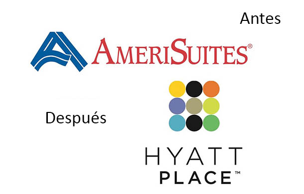
The Hyatt Hotels corporation bought AmeriSuites in 2004 and Lippincott was responsible for rebranding the chain as Hyatt Place, which was launched in 2006. Hyatt and the designers, who believed that the affordable executive suite business was being viewed as an inexpensive and boring alternative to improving hotels, they observed that the way to change it would be to offer the option to young entrepreneurs that, although they were not very rich, they appreciated luxury.
A critical component of the relaunch was to give each hotel an attractive lobby. The final logo was one combined with two different shapes. Mathews said that "a circle tends to be seen as modern and achievable and a square tends to be firm and disciplined ”. The design team chose vibrant colors for the seven circles and chose black for the other two. When hotel signs are lit at night, the colored circles create an “H” for “Hyatt,” which Mathews found fun, extra dimensions of the logo.
Starbucks
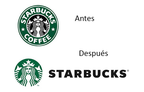
In recent years, Starbucks has grown into a global powerhouse and has been promoting its caffeine-free products such as cakes, sandwiches, and herbal teas. In 2011, they decided they wanted a simpler logo without being tied to the word "coffee". Mathews was not involved in the project, but her colleagues were.
The redesign started with a basic premise. When focus groups were asked what color the Starbucks logo was, participants almost always said "green." But the thing is that only the ring of the old logo was green, the character was the one that was highlighted in black. The designers removed the mermaid and put the color with which consumers identified the brand. They removed the word "coffee" and put the text outside the circle, as the mermaid was iconic enough to stand alone.
“This is a great example of how a logo can evolve”Mathews said.
NBC
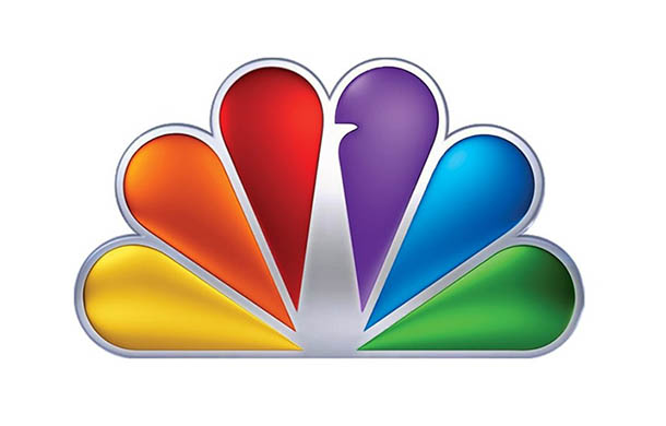
Lippincott hasn't worked with NBC, but Mathews said this is one of his favorite logos for the peacock idea. Think that the logo has improved over time and has become simpler and, although the colors celebrated the beginnings of color television, these still convey feelings of happiness and energy.
FedEx
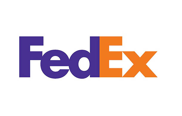
The FedEx logo is another of Mathews' favorites. As her work with the Hyatt logo shows, she likes images that surprise her, and the arrow formed by the "E" and "x" is one of the best hidden designs. He also appreciates the timeless nature of the logo "It could have been designed in 1970 or yesterday," he said.
It actually came out in 1994 and was created by Lindon Leader, who won over 40 design awards.
Apple
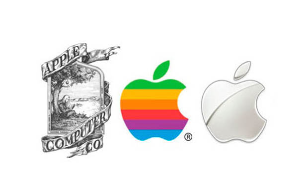
Mathews thinks that the Apple logo is a perfect example of how a logo needsadapt to the changing direction of what the company stands for. One of Apple's co-founders, Ronald Wayne, designed the first logo, a rare and detailed engraving of Sir Isaac Newton that was meant to represent the way Apple was an ambitious outsider.
That same year, Steve Jobs hired Rob Janoff to replace him with something more modern. Janoff came up with the iconic image of an apple with a bite in it and Jobs decided that Apple's unique approach to computers would be to represent it by making a rainbow of colors.
It went black and white in 1998 to fit in with the clean and simple designs the company wanted to pursue.
Regarding trends and presentation
When tackling a branding project, Mathews differentiates between "new and true." It says that the logo needs to be "true" in the sense that it should not be fundamentally tied to a trend, the “new”. The trend is more appropriate to support branding elements, such as experiences in stores or web pages. That said, a logo must be fundamentally sound but also adaptable to the new ways in which it is presented.
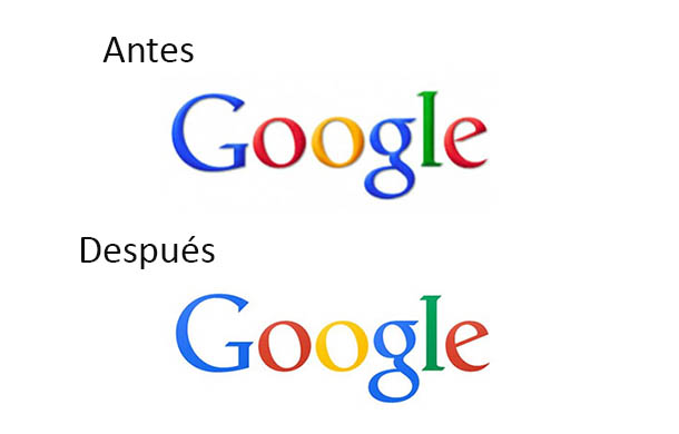
Logos used to be small enough to fit on a business card, but now they are much smaller and will fit on a cell phone, ”said Mathews. That's the reason why many logos have become flatter, in the sense that they have removed techniques such as shadows that added a dimension of depth or movement.
An example of how Google got flatter last year:
Fountain:
http://www.soyentrepreneur.com/







No Comment