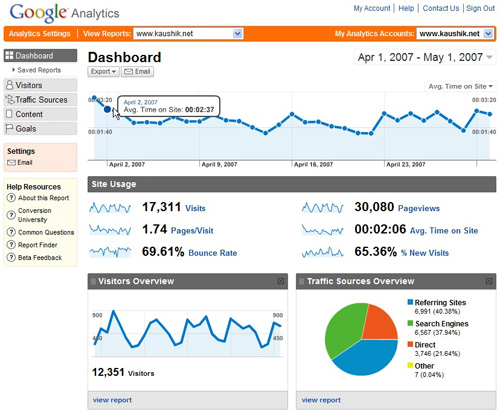
Every day we want to know in general terms and in the same report, how many people have visited the website, the keywords they have used to
find us, since which device has visited us ... metrics that we use to interpret results that help improve positioning
SEO, perfecting the web design, site optimization ... well, from Google Analytics we can create the dashboard that we all want, it is located within the main page reports.
Elaborating and / or modifying a panel is easy and intuitive, you can export to pdf or send the reports by email on a daily, weekly or monthly basis, and even if you have some
Limitations such as only adding 12 widgets per panel or not having widgets to add relevant comments, helps us to study the results at a glance, without having to change the tab or report. It is simple, understandable the first time and with graphics. I remind you that the information provided by these panels, let's say it is to "open our mouths", since then we must investigate more deeply to get to what was commented before, improve SEO positioning, improve web design, site optimization, creation of most relevant content ...
As a basis, Google Analytics provides a report with the option to modify it, but you can always start the dashboard itself from scratch. Each objective set needs a
special report, that is why the tool allows you to create up to 20 different panels per profile.
The results are customizable widgets, there are 4 different types:
• Metrics: It exposes in numerical value and below a mini graph with the evolution of the chosen time.
• Pie chart: the famous cheese is highly demanded to see results of dimensions. For example, % of visits per social network.
• Chronology (linear): It is a graph with the evolution of the selected metric. You have the option of making comparisons with other metrics.
• Table graph: displays a table with up to 10 rows and 2 different metrics. It reminds me of pivot tables in Excel.
To start using the dashboard option, my advice is to create a generic panel that serves to understand the website, and once we understand how it works, create new panels focused on referrals, subscribers, adwords, leads ... what each company sees fit. Although we do a generic panel, we must think about the needs we want to cover, so the report will be effective and beneficial 100%. When I started my adventure in the Analytics world, I created a dashboard that I still have and that I still use.
I detail the basic panel that I use daily:
Metrics:
1. No. Visits.
2. Average time on page.
3. No. of pages viewed.
Pie chart:
1. Percentage of visits by type of visitor.
2. Percentage of visits by type of traffic.
3. Percentage of visits by type of social network.
Table graph:
1. Number of visits per keyword and average time on the page.
2. No. of visits by city and percentage of new visits.
3. Number of visits per page title and average time on page.









No Comment